CASE STUDY: ONE COFFEE
Client Overview
ONE COFFEE is a modern specialty coffee brand from Romania, focused on delivering high-quality roasts with a clean, contemporary consumer experience. Their mission is simple and powerful: to bring accessible specialty coffee to a wider audience while maintaining exceptional product standards.
As the brand began to expand toward retail, horeca partnerships and new product formats, they needed a distinctive identity capable of standing out in an oversaturated market.
Challenge
When the ONE COFFEE team approached us, their visual presence was fragmented and lacked a unified brand direction. They needed:
- A clear, modern identity aligned with their product quality
- A system that could scale across packaging, stationery, retail touchpoints and digital
- A recognizable, premium, minimalist look aligned with global specialty coffee aesthetics
- A consistent execution across multiple physical and digital applications
- A brand capable of supporting future expansions and product collections
In short: they needed a coherent, scalable and unmistakable brand system.
Objectives
Our goals for the project were to:
- Create a strong and versatile brand identity that reflects quality, clarity and trust
- Develop a visual language that works across packaging, print collateral, delivery materials, and digital
- Establish a distinctive shelf presence in the competitive specialty coffee market
- Build a brand system that ensures long-term consistency while remaining flexible for future sub-ranges
Brand Strategy
Our strategic direction centered on two pillars:
1. Simplicity with Purpose
The brand needed to communicate quality through clarity. We opted for a clean, modern aesthetic based on minimalist geometry, balanced typography, and a neutral yet highly recognizable color system.
2. Functionality Across All Touchpoints
We approached the identity as a modular system—every element needed to scale from a tiny label to a large delivery van. The brand components were designed for consistency, legibility, and easy integration across all future products.
The Creative Process
Naming Validation & Brand Positioning
Although the name ONE COFFEE was already defined by the client, we refined its conceptual territory to emphasize:
Quality as a standard
Simplicity as a differentiator
“One” as a symbol of precision, focus and curation
Logo Development
The logo is a minimalist typographic form built for instant recognition. It balances:
clean linear construction, straightforward forms, a contemporary, premium tone
It serves both as a functional wordmark and as an anchor for the whole identity system.
Typography & Color System
We implemented a two-tier typographic hierarchy that keeps communication sharp and legible.
The color palette combines black, white and controlled accent tones, giving the brand a timeless, modern, high-contrast look that performs well both in print and digital.
The color palette combines black, white and controlled accent tones, giving the brand a timeless, modern, high-contrast look that performs well both in print and digital.
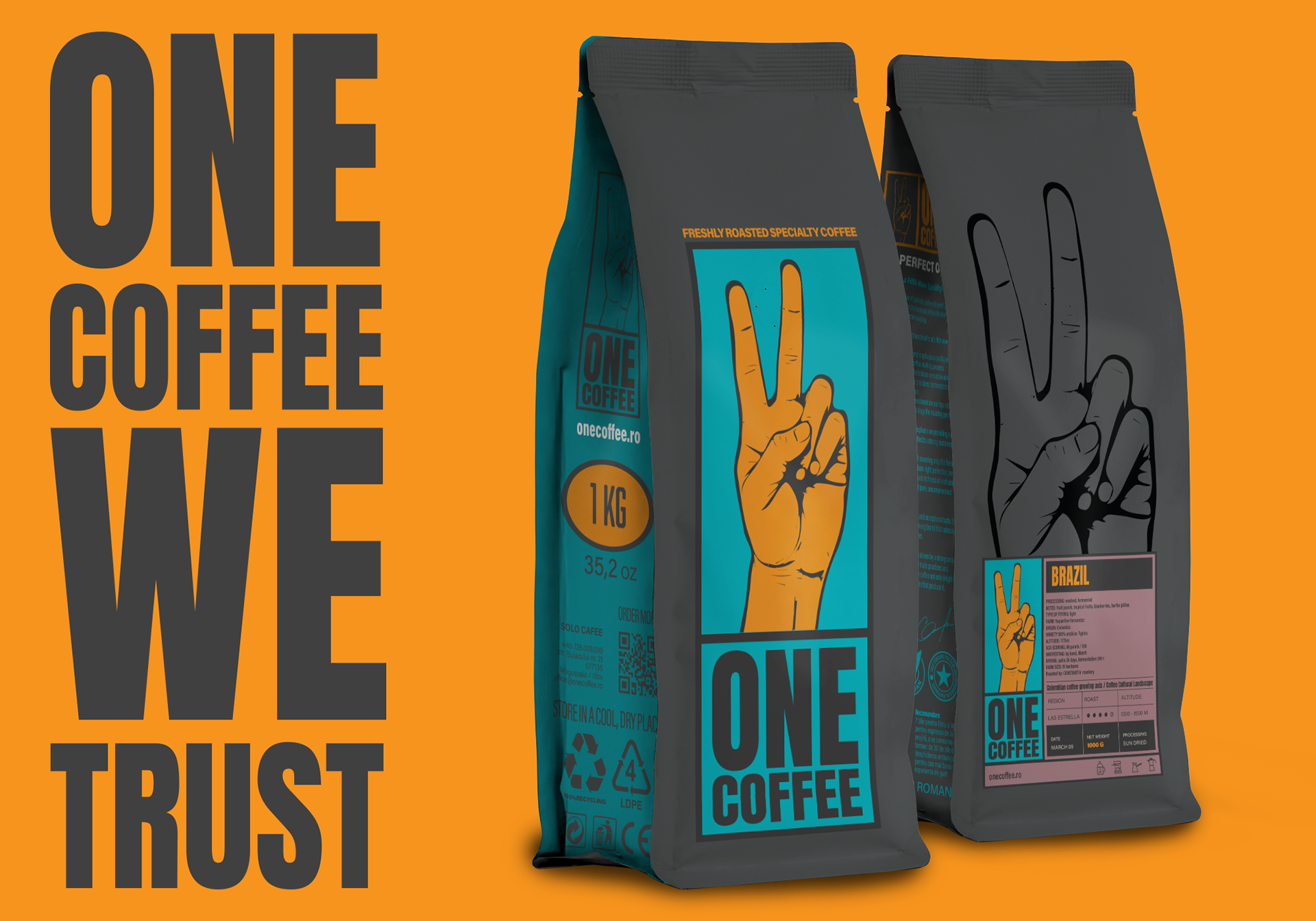
Packaging System
Packaging is the heart of the ONE COFFEE brand.
We designed a scalable system based on:
We designed a scalable system based on:
clean layouts, information clarity, high visibility on shelf
a minimalist structure that supports product differentiation
Each product features a consistent architecture:
brand block → product info → roast details → accent elements.
This ensures recognition at a glance, regardless of the variant.
brand block → product info → roast details → accent elements.
This ensures recognition at a glance, regardless of the variant.
Stationery & Collateral
We extended the visual identity to a full set of physical applications:
stationery suite (business cards, letterheads, envelopes), branded labels and tags, shopping bags and delivery materials, merchandise concepts
The system retains the same clarity and modernity across all formats.
Vehicle Branding & Outdoor Applications
The brand was adapted to large-scale surfaces for delivery and operational use.
We designed a clean, striking visual approach that ensures brand presence in traffic and urban environments while staying fully consistent with the minimal identity system.
We designed a clean, striking visual approach that ensures brand presence in traffic and urban environments while staying fully consistent with the minimal identity system.
Digital Integration
ONE COFFEE’s website (onecoffee.ro) reflects the same visual ethos—simple layouts, clean typography and easy navigation—ensuring that the experience online mirrors the physical product journey.
We defined the brand’s visual direction for social media, giving the team a consistent toolkit for content creation, promotions and storytelling.
Results
Since the launch of the new branding, ONE COFFEE has:
strengthened its position in the specialty coffee market, achieved a more premium, cohesive and modern brand perception, improved product visibility in both retail and horeca partnerships, built a unified and professional presence across all customer touchpoints, gained a scalable visual system ready for future product expansions and collaborations
The rebrand helped transform ONE COFFEE into a clear, focused and recognizable specialty coffee brand.