Our world moves quickly, and it seems like there is a new trend that every company should adopt right away. We must stay current not only with external developments but also with internal ones. Your brand may no longer have its gleaming sheen, and you may begin to doubt whether it still really captures who you are and, more crucially, whether it will lead you in the direction you seek.
Even the greatest firms in the world have modified their brand identities to keep up with it all since it can be difficult to stay current while being true to your essence. Some of them were so spot-on that it's nearly difficult to recall how they were.
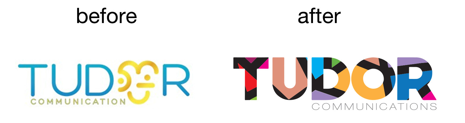
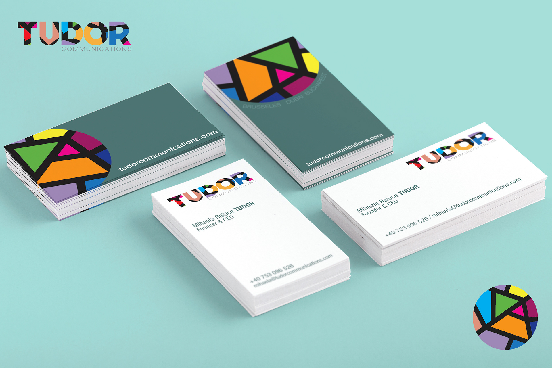
Since there are several situations for using TUDOR brand name and logo from the graphic and visual point of view, we have a linear logo and a symbol logo.
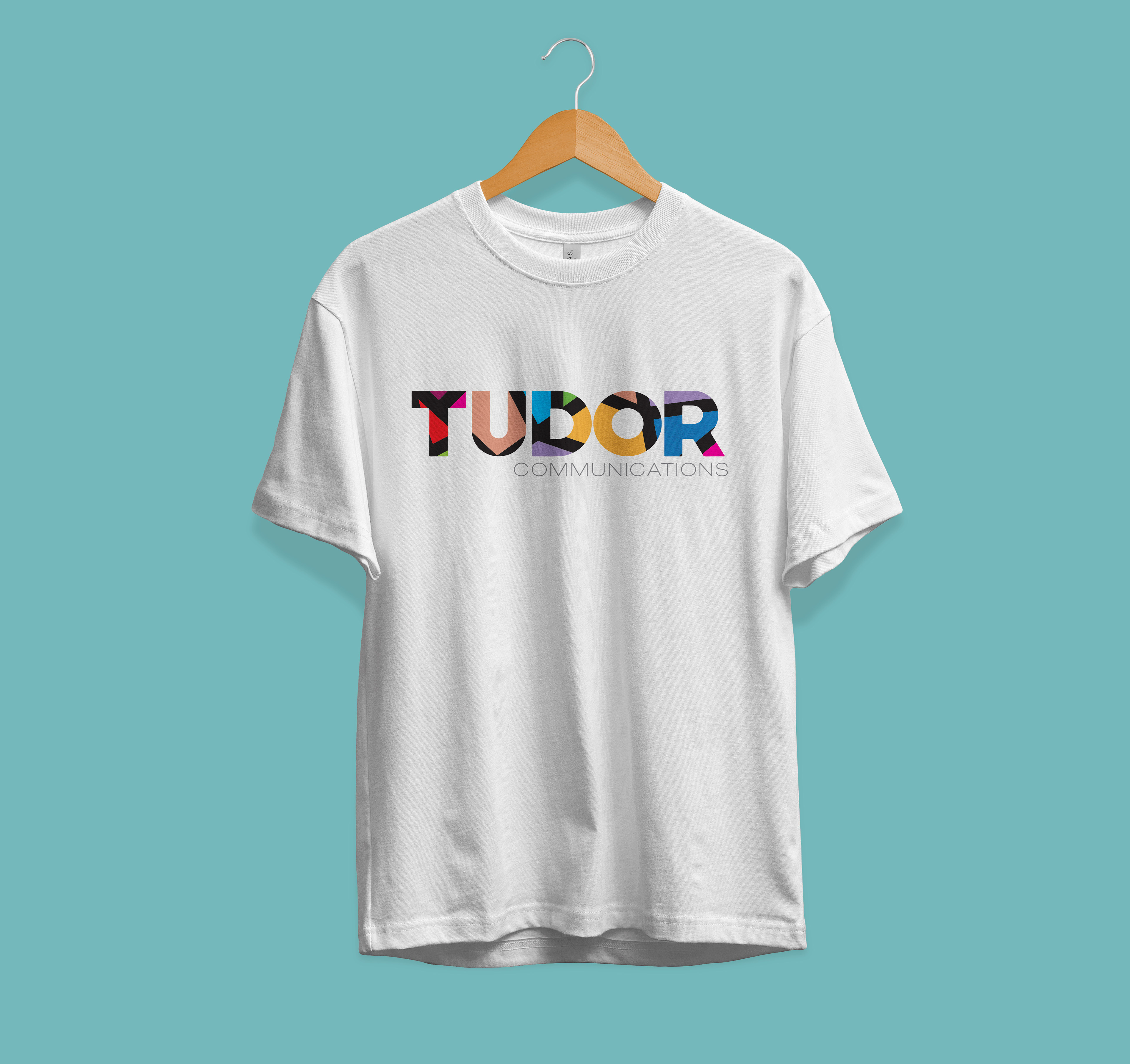
The Linear Logo is a powerful image evoking the culture of communications services - the connection between the strength of communication and the different points that influence.
The Logo Type has been carefully chosen for its modern and yet refined, highly legible style, which has been further enhanced by the use of upper case letters. The typeface is modified Helvetica and has also been chosen to compliment and balance perfectly.
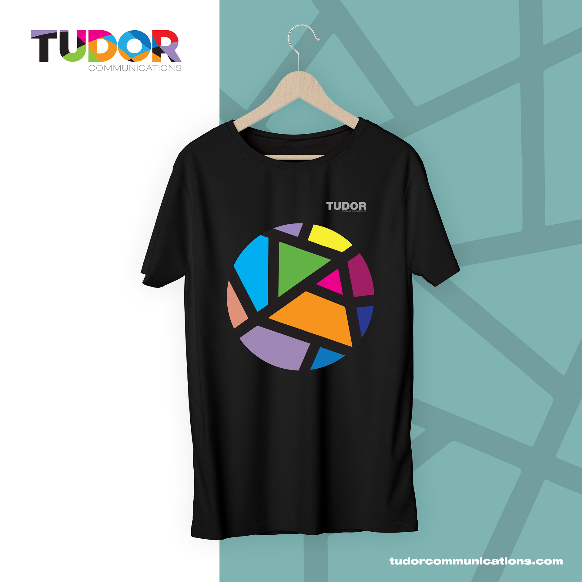
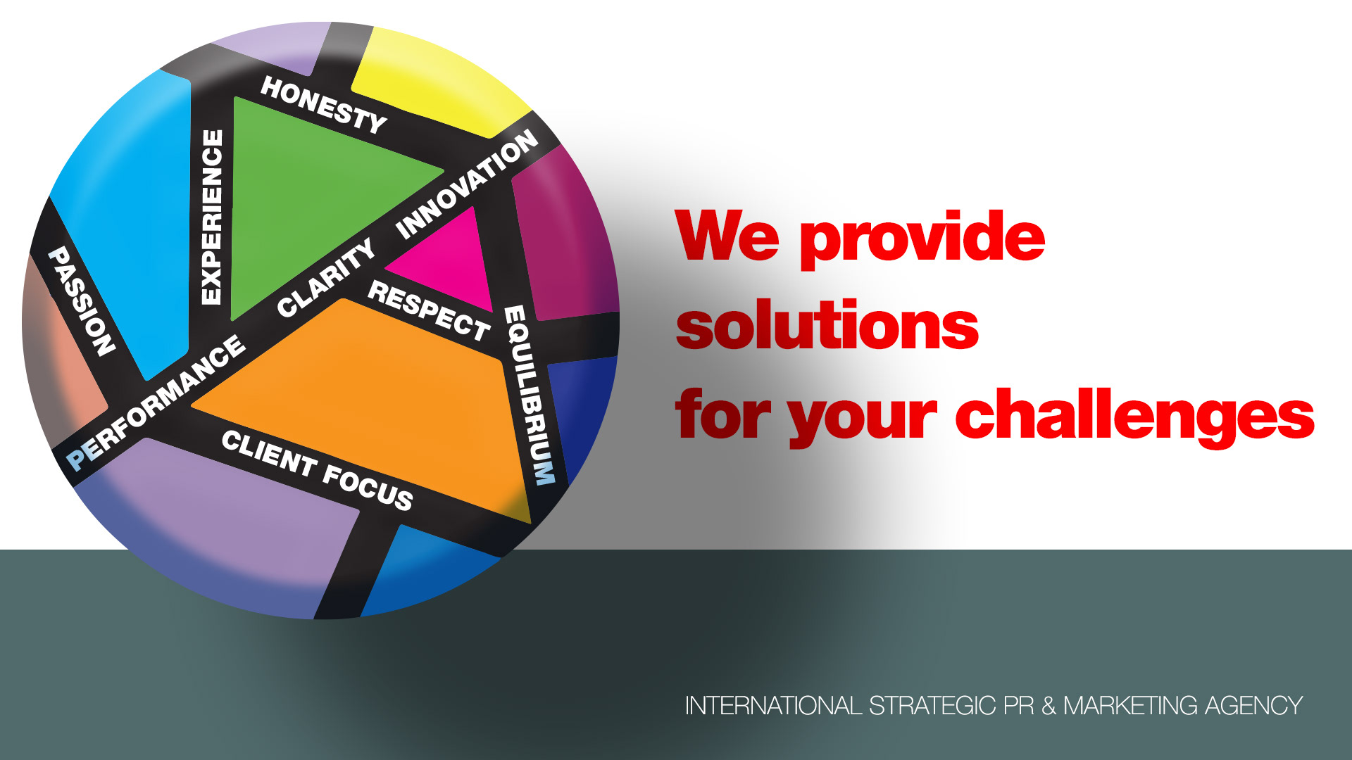
The Logo Symbol consists of a powerful element evoking the culture of communications services and the diverse area of expertise. The symbol logo could be used as illustration, graphic support for company written materials, space decoration or promotional materials.
A logo is an easily recognizable graphic symbol that identifies a company, a commercial product, or any public or private entity. It is one of the ways to distinguish a brand in a competitive world, full of graphic elements that try to attract our attention every day. Our TUDOR logo is:
1. Simple
Simple logos are the ones people can recognize as soon as they see them. The simplest logos are the ones people remember the most.
2. Scalable
TUDOR LOGO is simple enough to be able to be scaled down or up and still look good.
3. Memorable / Impactful
TUDOR LOGO is impactful. It capture the viewer’s attentions and leave an impression (a positive impression, in our case).
4. Versatile
TUDOR LOGO look equally good on any web device and on any kind of print material.
5. Relevant
TUDOR LOGO is relevant to the company practice. It is dynamic, colorful, illustrating the large spectrum of activities and a young team with international experience. It describe the agency multiple area of expertise and the complex solutions they have for clients needs.